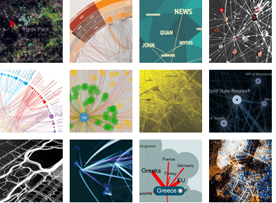
I’m at a PhD Lab event and the speaker, Ann Pendleton-Jullian, just mentioned this awesome looking website, Visual Complexity .
.
It’s a site about different ways to visualize data. Its about how you frame what you think is most important in the information. Think about that famous information map that links the temperature to Napoleons retreat in Russia.
