Digital cartography is not the only means of mapping sovereignty. New digital tools offer other means of mapping other components of sovereignty that extend beyond space, including social relations and timeframes. Different visualizations can address issues that text and maps may fail to capture, often in a very pointed manner. However, digital tools tend to be suited to specific messages and may leave less room for interpretation of ambiguities. Utilizing digital visualizations necessitates choices about what the purpose of each image will be. As such, crafting visualizations of social networks and timescales for digital humanities research requires constant methodological vigilance, including an awareness of the limitations of specific models.
The project of Mapping Sovereignty began with locating colonial charters and extracting information from them to form a database. The database includes the parties involved in the charters, geographic information, legal rights granted, and other data. It offers a wealth of information for producing different visualizations to analyze certain angles of the sovereignty issue. That said, the database also presents some problems. Certain charters, such as the 1676 Quinpartite Deed of Revision, do not fit naturally into visualizations. Unlike most of the charters, the Quinpartite Deed involves the division of land in present day New Jersey between five proprietors, rather than a straightforward grant from a sovereign to other parties. Creating a coherent dataset that can easily be coded into a visualization requires paring down a database, which can have the unfortunate side effect of the removal of interesting data points. Visualizations may be helpful for larger trends, but case studies are necessary to explain exceptional charters.
Social Network Visualizations
The organization of colonies as described in charters offers fertile ground for social network analysis. Both proprietary and corporate structures involved grants by an individual, usually the sovereign, to groups of proprietors or investors named in charters. Some individuals received grants or owned shares in a number of different colonies. They interacted with one another directly and through the Crown, Privy Council, and other bodies of government. Often, these inter-personal relationships get lost in the dense text of charters. Social network visualizations bring those relationships to the forefront and enable us to trace how individuals might have obtained different grants or investments in a time when proximity to the Crown or other prominent individuals could determine involvement in colonial ventures.
The templates for social network visualizations in this project came from d3, an online library of digital visualizations. d3 makes it relatively easy for an experienced coder to plug in data and create visualizations. Though the d3 library contains many different models, relying on it does limit projects to preexisting forms. Visualization software demonstrates the importance of a developed “digital” skillset in conducting digital humanities research, and a greater expansion of this project would require higher level programming skills.
Hierarchical Edge Bundling
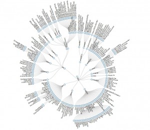
Hierarchical Edge Bundling Model for Colonial Charters
The Hierarchical Edge Bundling visualization shows the relative importance of individuals in a social network by exhibiting the visual density of connections. Specifically, this tool allows viewers to gauge the involvement of individual proprietors, investors, and charter granters in the colonization process. By counting individuals’ connections and locating commonalities, it is possible to trace how they might have successfully jockeyed for their stakes in colonies.
As might be predicted, charter granters had the greatest density of connections, although some investors and proprietors like John Wollaston, who later served as Lord Mayor of London, also had several social connections.[1] The ability of monarchs to wield such social influence through charter grants speaks to the importance of these documents, even if their exact stipulations were often ignored in the colonies. In his book Brokerage and Closure: An Introduction to Social Capital, sociologist Ronald S. Burt concludes, “People whose networks bridge the holes are brokers rewarded for their integrative work.”[2] Based on the evidence in this visualization, it is possible to conclude that monarchs served as the critical brokers in the colonization effort, though their close associates on the Privy Council may have played subordinate broker roles.
The conclusion that early-modern sovereigns were instrumental in colonization and chartering colonies may seem obvious. That said, this model also presents several jumping off points for future projects. For instance, who were some of the well-connected investors like John Wollaston or Sir George Carteret? It could also be interesting to remove charter granters from the model and portray individual investors’ connections to one another through charters to identify “brokers” within the community of investors and proprietors.
Ideas for future projects also point to some of the limitations of this visualization. Though relationships become clear through research on the individuals in the image, the visualization itself does not show the nature and direction of relationships. The way the visualization is constructed, one might gather that King Charles II was equal in status with the investors to whom he granted charters. More research, visualizations, and text are necessary to fill out a social map of sovereignty.
Radial Reingold-Tilford Tree

Initially, the Radial Reingold-Tilford Tree appeared to be well-suited to the visualization of social networks in colonial charters. Charters could have been the inner “clouds” in the model, with those granting charters as the intermediate nodes, and grant recipients and investors at the outer nodes. This would have depicted the “direction” of charter grants and the nature of power in relationships in a way that the Hierarchical Edge Bundling model did not. Unfortunately, data must be “hierarchical” for the code of this visualization to work, meaning that no relationships can be equal in character or status. The model will not work if an individual occurs in more than one place in a database. The Reingold-Tilford Tree demonstrates one of the challenges of digital humanities work. It is easy to visualize effective models, but the practicalities of coding and the form of a database can limit a project.
Timelines
Timeline of Charters in the Database
Timelines are useful for providing a larger sense of scope for a project. The timeline above traces the granting of charters in our database. The visualization shows that the 1640s and the 1660s were the busiest periods for the granting of charters. Timelines present many opportunities for expansion. It might be interesting to include other events from English and colonial history in the timeline to consider how an event like the War of the Three Kingdoms affected the expansion of the empire. Other material from the database, such as the geographic information or the legal content of grants, could allow for a visualization of how charters evolved through time. A colony that was subject to many charters, such as New Jersey, could have its own timeline placing the many documents on a continuum to show how one charter replaced the next. All of this is relatively easy to complete with the TimelineJS program. However, TimelineJS does require the creation of Excel spreadsheets, and therefore may present some of the same issues with database consistency that occur with visualization software.
The Historiography of Network Visualization for the Early-modern Period
Some of the inspiration for network visualization in the Mapping Sovereignty project comes from Stanford University’s “Mapping the Republic of Letters” project that depicts the influence of Enlightenment thinkers. For instance, the Stanford researchers used maps and a variety of other visualizations to show how expansively Voltaire corresponded and where his works were published. Further research on social networks for Mapping Sovereignty could similarly dig into documents like Privy Council minutes and correspondence to develop the nature of the relationships between different investors, proprietors, and other entrepreneurs of empire. The University of Virginia’s VisualEyes projects, and especially the “Jefferson’s Travels” case study, show the potential to join time sliders and timelines with maps and other visual tools. While the Mapping Sovereignty case studies already use time sliders to show changing geographic claims, perhaps timesliders could be applied to networking software to show the evolution of social networks under different monarchs. All told, the Mapping Sovereignty charter database presents ample material for the further use of different visualization techniques.
Notes
[1] “Chronological list of aldermen: 1601-1650,” The Aldermen of the City of London: Temp. Henry III – 1912 (1908), pp. 47-75. British History Online. https://www.british-history.ac.uk/report.aspx?compid=67241. Accessed April 24, 2014.
[2] Ronald S. Burt, Brokerage and Closure: An Introduction to Social Capital (Oxford: Oxford University Press, 2009), 9.
